
In my former roles as AMHS Manager and Automation Technology Development Leader, I’ve sat through fab “Ops Review” meetings where each module owner is responsible for highlighting relevant issues impacting fab operations. In those meetings, while working at three different semiconductor companies, I found a common link between these different fabs—a link pertaining to the consistency of data visualization. Several commonalities exist, including a fab dashboard for 30 days showing moves per hour (MPH), delivery time, alarm Paretos over time, and storage utilization ordered by bay.
In this blog I focus on the 30-day AMHS dashboard report. The idea is on a single chart—30 days’ worth of trends, commonalities, and irregularities are communicated at-a-glance. Figure 1 shows the typical dashboard I’ve observed at most fabs.
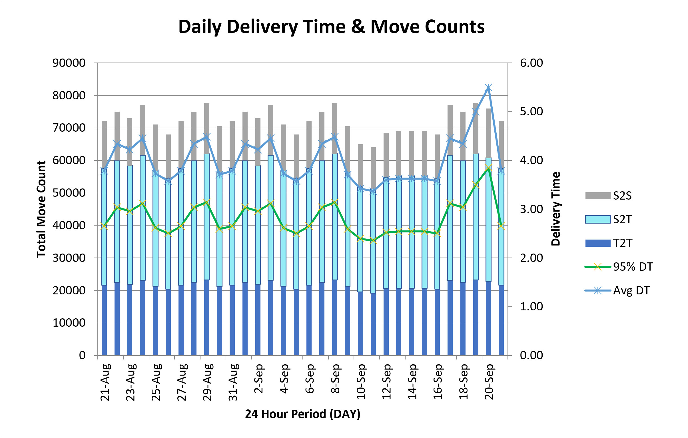
The dashboard in Figure 1 consists of x, right, and left axes, explained next.
- The bottom x-axis shows the time under review, in this case a 30-day trend of 24-hour movement statistics.
- The right axis shows the average and 95th percentile delivery times achieved by eliminating the outliers (the top 5% times). This is represented in the two-line charts and is the bread-and-butter KPI metric for AMHS optimization. It is a lagging indicator of how efficient the storage optimization and move dispatching capability may be in the factory. Naturally, the focus is drawn to the outliers where delivery time is trending higher. These trends usually require an explanation to management in an Ops Review. Outliers are sometimes tied to a new tool or AMHS bay coming online and usually indicate the need for better organization of up-stream storage locations or improved scheduling logic to ensure material is stored closer to the tool, which leads to shorter delivery times.
- The left axis shows the total moves per 24 hours (MP24) using a stacked chart representing three move types: stocker-to-stocker, stocker-to-tool, and tool-to-tool. The stack total represents total moves within a 24-hour period. The stacked chart is interesting data to visualize because this is where we can glean clues of move type trends over time. For example, some days a rush to storage is evident, while on other days there is a greater emphasis on tool moves. These trends are typically aligned with factory-specific milestones that can be highlighted as required.
Step 1 – Analysis of a Move
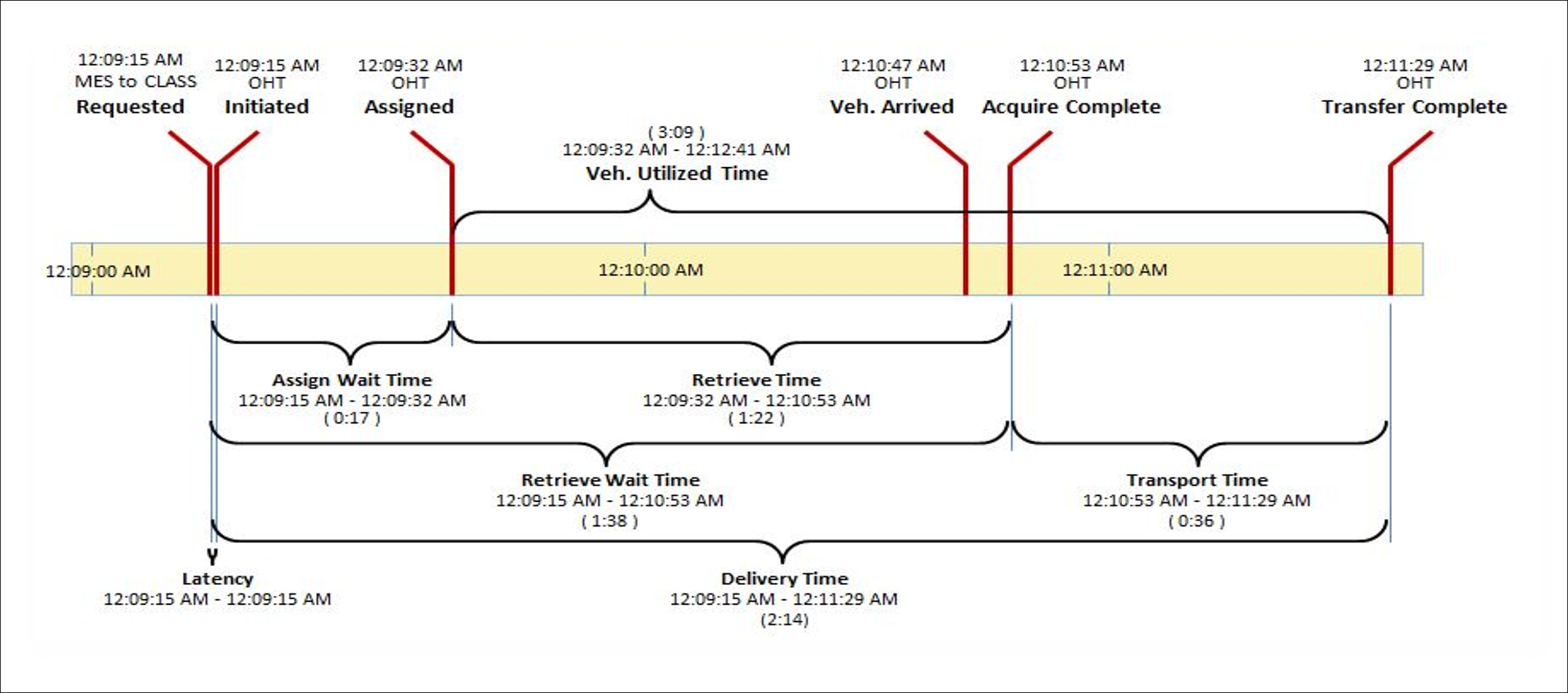
In Figure 2 the Delivery Time is the amalgamation of several events occurring, most notably the sum of assign-wait, retrieve, and delivery times. The other key point here is the definition of a move. A move begins with the MES move Requested and ends with the overhead transport (OHT) event of Transfer Complete. It’s important here to point out that a stocker-to-tool move will consist of one macro-Transfer Complete move (from the MES perspective), which simultaneously means that we will have two micro device complete moves (one from the stocker, one from the OHT). Distinguishing between MES moves and device moves is key to how we store this information in MCS statistics tables.
Step 2 – Data Organization
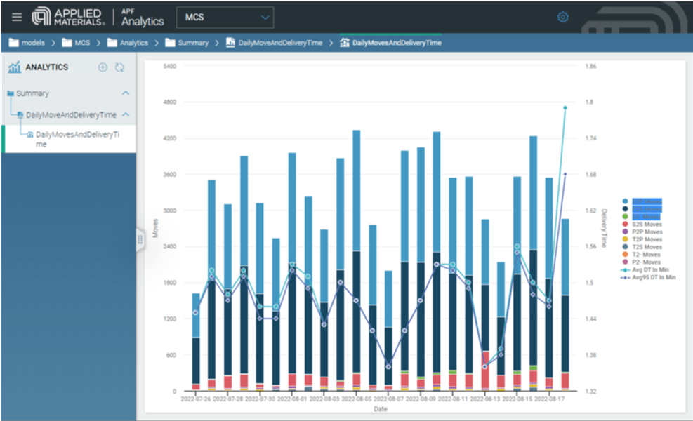
Here then is the secret sauce to all of this—the data organization. The CLASS MCS 5 data storage structure, illustrated in the anatomy-of-a-move in Figure 2, is all inclusive into one single table called SCARMOVE_SUMMARY. This table represents the infusion and feedback from our customer user groups, where we achieved alignment on a single storage organization strategy. The table looks something like the one shown in Figure 3.

Step 3 – Data Visualization
Ready to contact us to learn more about this or other charts to improve productivity?